Cambrian College
Since 1967, Cambrian College has been the leading post-secondary institution in northern Ontario. The college has a vibrant community of more than 11,000 students, with more than 6,000 students in over 100 full-time programs, and 7,000 students in part-time courses and programs across three campus locations in northern Ontario: Sudbury, Espanola, and Manitoulin Island.
Since 2012 I have been working in the Marketing department as a Graphic Designer where I work with clients across various departments to create beautiful and meaningful designs that help support recruitment and conversion strategies. Below is just a small sample of the work I do every day.
Client
Cambrian College of Applied Arts and Technology
Disciplines
Branding & Identity, Editorial & Print, Illustration
Cambrian College Rebrand
In 2022 Cambrian College decided to embark on a multi-year plan to rebrand the college. After consulting with multiple design firms, senior leadership decided that the in-house design team consisting of myself and my colleague were to take on the task of a rebrand. Through many months of research, iterations, and user-testing, we chose a new logo and launched the first phase of the new brand in January 2024.
The Logo
The logo consists of two elements – the impossible “C” shield and the wordmark.
The shield is comprised of two twisting shields that represent innovation and the understanding and new perspectives that comes with education. They also bear a likeness to the two “C” letters in the college’s name.
Logo Construction
In honour and respect of the college’s previous visual identity, the following elements have been incorporated into the logo:
The new logo is a twisting shield, accented with a flame, a symbol of the enlightenment that comes with education and study. This flame as well as the shield’s shape is connected to the College’s Coat of Arms. The shape of the flame pays homage to the dragon’s mane of the previous logo.
Time Capsule
For Cambrian’s 50th anniversary, the College’s senior team decided to commemorate the occasion with a time capsule. I was tasked with the design of the exterior. I suggested that the enclosure should present a short history of the 50 years leading to its sealing.
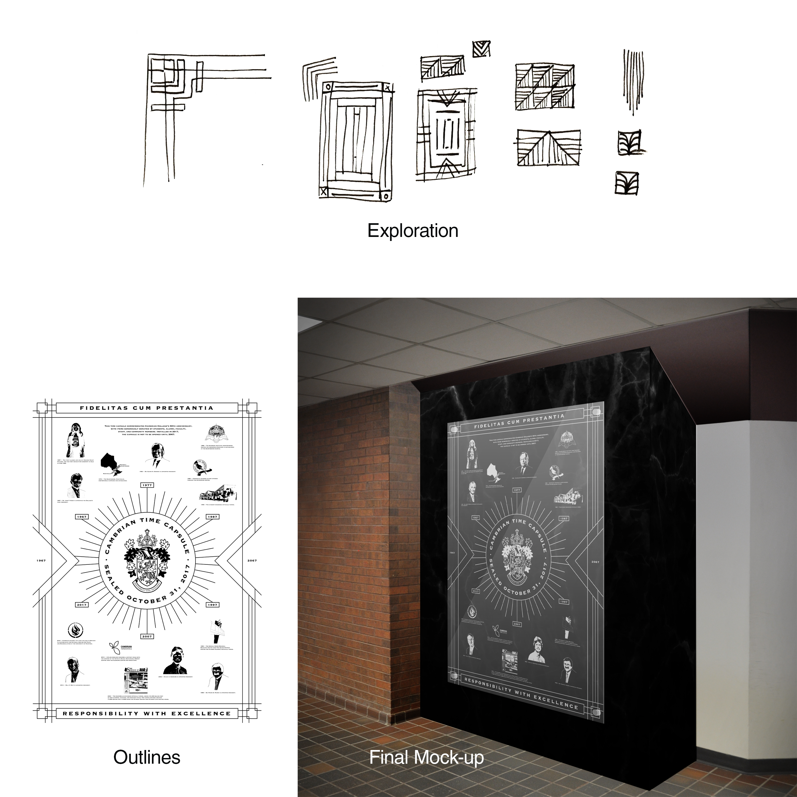
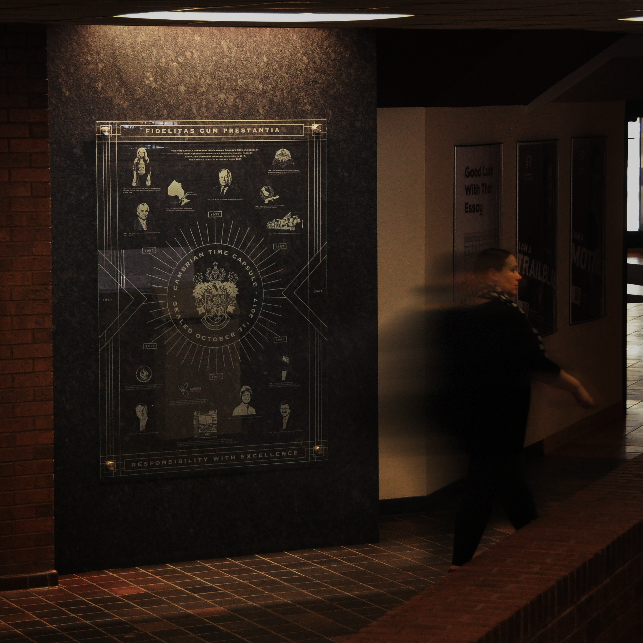
Denouement – The Untagnling
I designed an intricate timeline to represent the college’s major milestones to be emblazoned on glass, then elegantly displayed over a granite time capsule – granite harkens to the geology of the Sudbury basin, as granite is ever-present in the landscape. The glass went through a special emulsion printing process to imitate an etched look while preserving small details in the artwork.
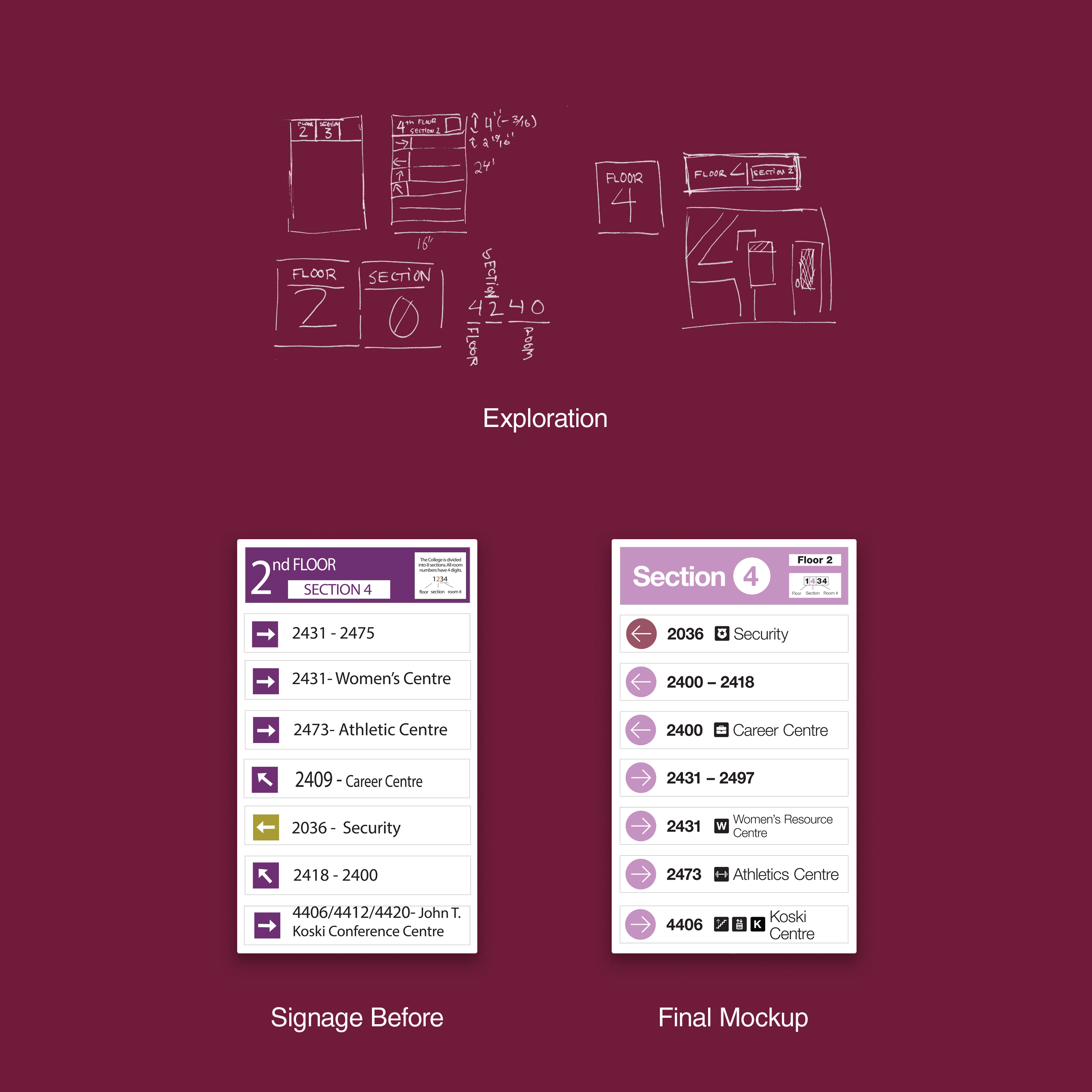
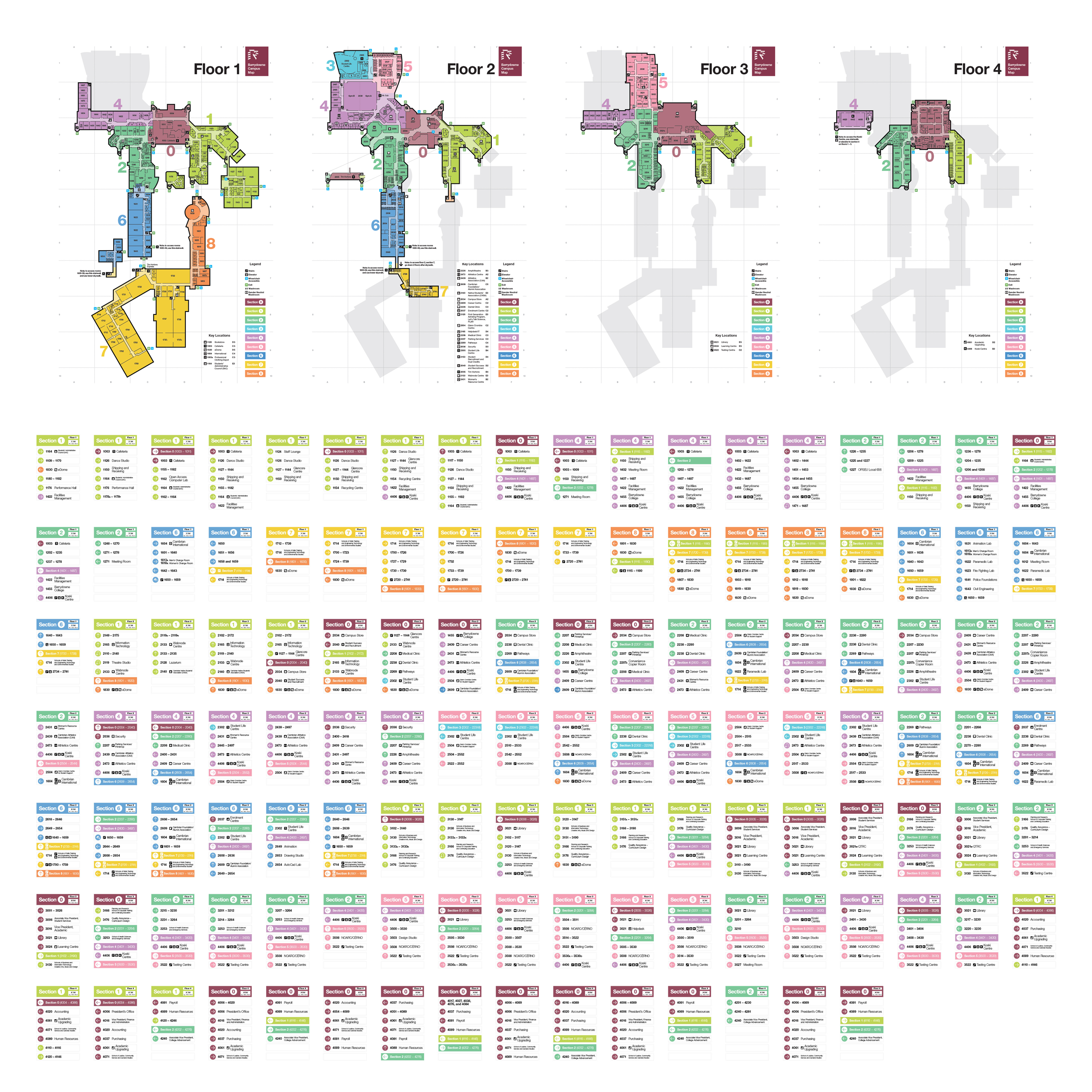
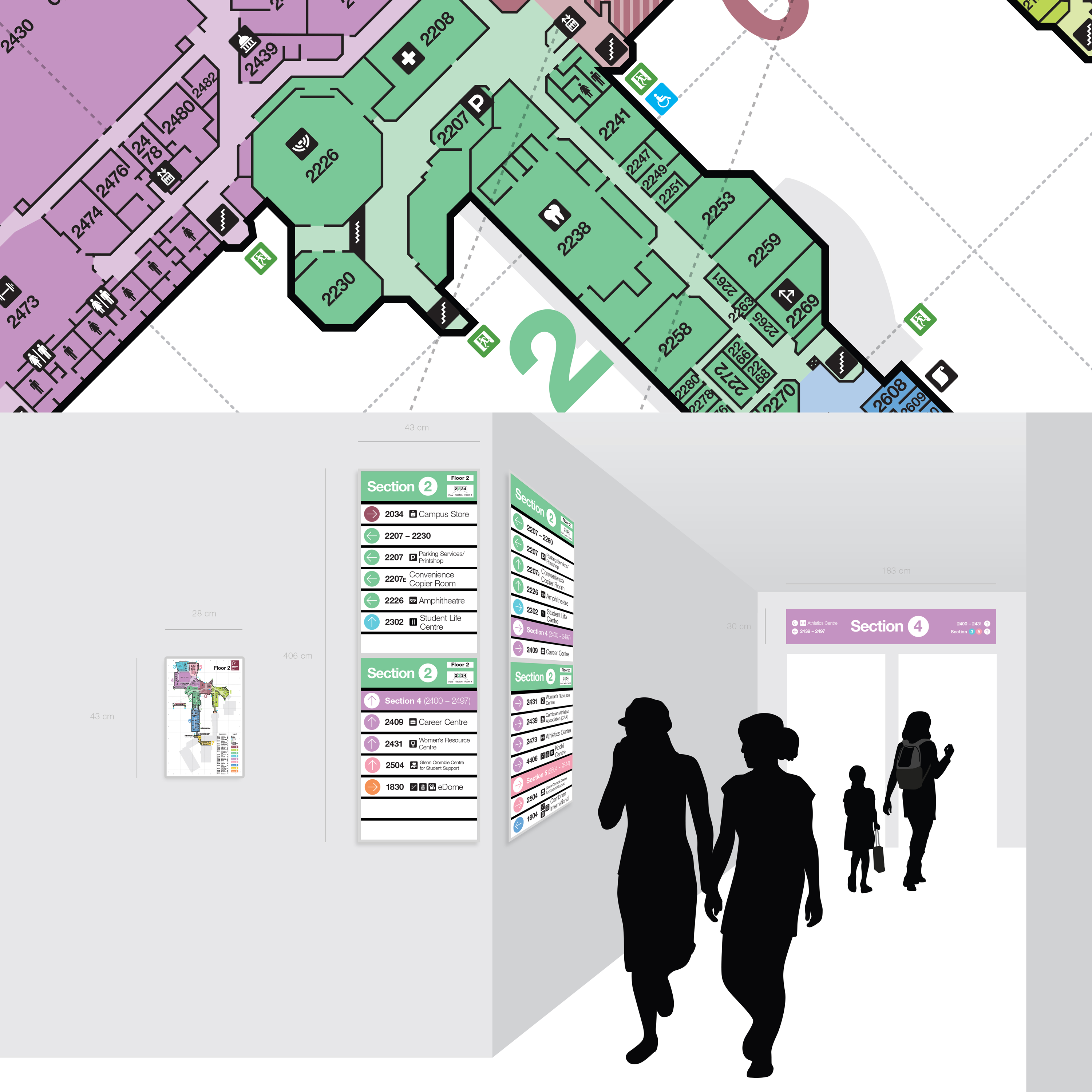
College Wayfinding
Cambrian’s floor plan is notoriously difficult to navigate, so I decided to take it upon myself to create a new wayfinding system that would help people find their way across campus. As a self-led project, I initially needed to use my spare time to work on concepts to present to managers and decision-makers. Part of the challenge was the need to work within existing infrastructure due to budget constraints. After months of trials and error, I presented my concepts to senior team and got approval to go ahead with the new system. I worked with an accessibility advisor to choose colours and font sizes and weights that would be accessible to all, as well as fitting within the Cambrian brand and being aesthetically pleasing.